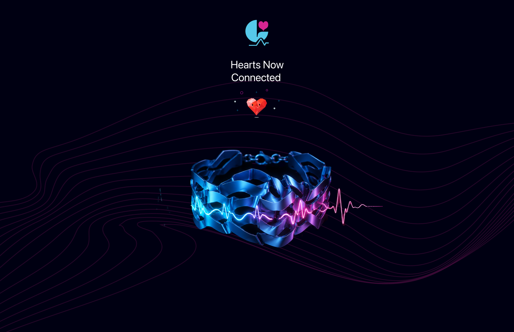
Lapis — UX/UI Design
Case Study II
Helping people preserve emotional connection through thoughtful digital experiences.
View Prototype ↗Project Brief
Translate a research-driven concept into an intuitive mobile experience that helps users capture a loved one's heartbeat, personalize a wearable keepsake, and seamlessly bring it to life.
I designed the experience with an emotion-first mindset, evaluating every interaction through a simple question: does this feel warm and personal rather than technical? Visual language, motion, typography, and interaction patterns were all crafted to create a calm, intimate flow that kept the focus on human connection instead of technology.
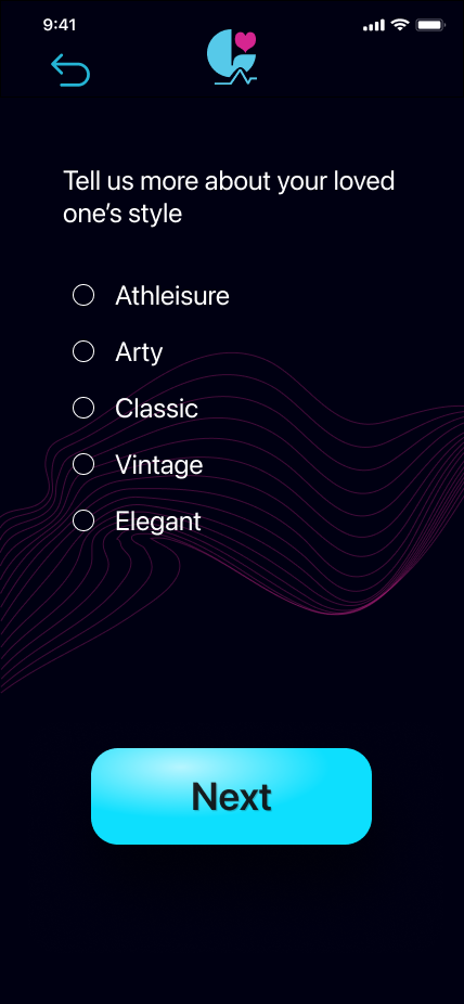
Designed a high-fidelity end-to-end prototype covering the complete journey, from onboarding and heartbeat capture to wearable customization and order confirmation. The experience supports multiple recording scenarios while maintaining a clear, consistent, and emotionally engaging flow.
Lapis was developed as part of my MA in Human Experience Design Interactions at California State University, Long Beach. This case study focuses on how research was translated into a thoughtful digital experience, highlighting the UX/UI design process from concept to high fidelity prototype. A companion Human Factors Research case study explores the research methods, user insights, and scientific foundations that shaped the design decisions.
A heartbeat is invisible and difficult to interpret. The challenge was to transform biometric data into an experience users could immediately understand and emotionally connect with, without exposing unnecessary technical complexity.
Capturing a loved one's heartbeat is a deeply personal experience. Every interaction needed to minimize cognitive effort, reduce uncertainty, and preserve the emotional significance of the moment. Simplicity wasn't just a usability goal; it was essential to supporting the intended emotional experience.
Research & Affinity Mapping
Synthesizing insights from interviews, literature, and naturalistic data into design directions.
Physical touch carries emotional weight that visual or digital formats cannot replicate. The bracelet must be felt to fulfill its purpose.
People regulate emotional states through physical objects tied to absent people, a behavior pattern that predates and justifies the Lapis concept.
The felt sense of connection, not just communication, is what people seek. Lapis needed to translate that feeling into material form.
Why people keep objects from the past, what makes an object feel like a person, and how proximity to objects activates memory and emotional regulation.
Competitive analysis revealed a gap: existing biometric wearables track health but carry no emotional or memorial purpose. Lapis fills that gap.
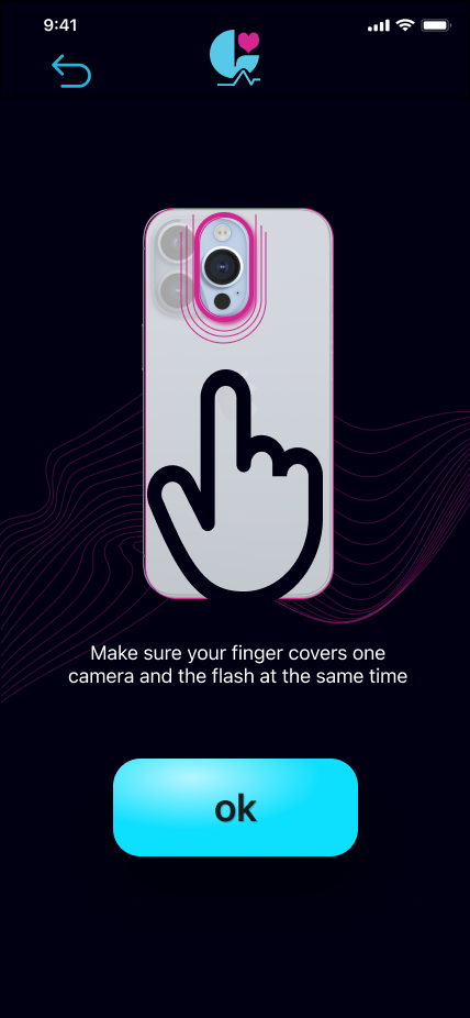
Oxytocin release through touch, PPG capture via smartphone camera, and parametric modeling of HRV data provided the technical scaffolding for the concept.
Vision & Inspiration
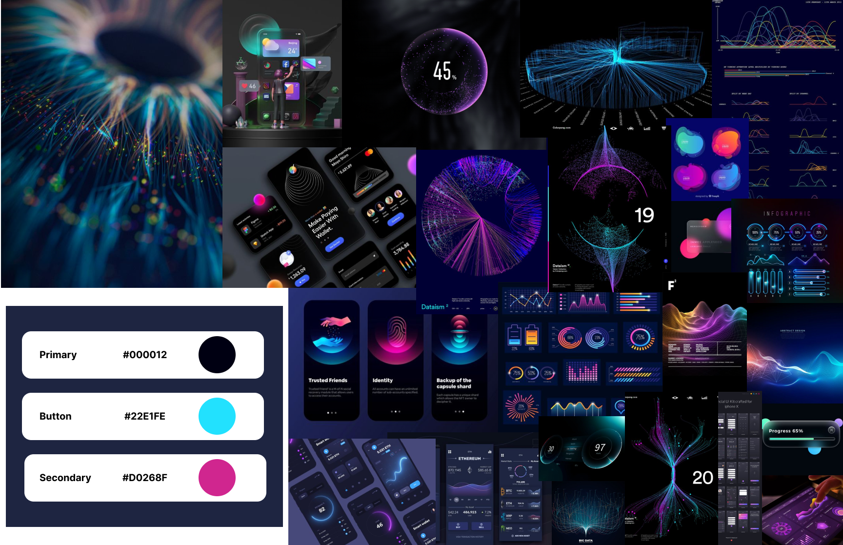
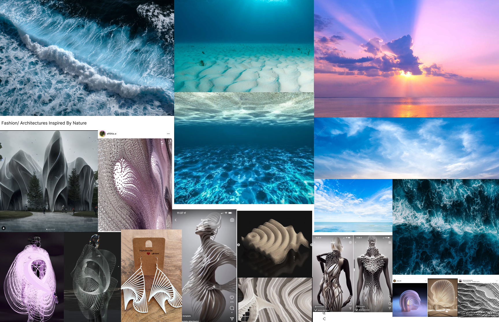
Two parallel directions: the digital aesthetics of the app interface, and the material language of the physical bracelet.
Dark, immersive interfaces where biometric data becomes something beautiful rather than clinical. Referencing health apps that make invisible body data visible and meaningful: the visual language of data streaming from a living system, bioluminescent gradients, and quiet darkness that makes light feel significant.
Parametric jewelry, computational material structures, and biomorphic 3D printing. The bracelet needed to look like it came from a biological process: organic lattices, wave-derived textures, and forms that carry the fingerprint of a heartbeat's amplitude and rhythm.
Style Guide
The visual language of Lapis: color, type, and UI components designed to make biometric data feel intimate rather than clinical.
100px radius · SF Pro Bold
Back arrow · Logo · Share
HRV capture · Dark overlay motion
Storyboard
Sara's journey: an Italian immigrant in her thirties, living in Canada, reconnecting with her mother through Lapis.
Sara, an Italian immigrant in Canada, sits alone after a call with her mother. Distance has become a weight she carries.
Sara sees an ad for the Lapis app. She downloads it, curious about the idea of a bracelet made from her mother's heartbeat.
The app guides Sara to invite her mother. Across the Atlantic, her mother receives a notification and opens the link.
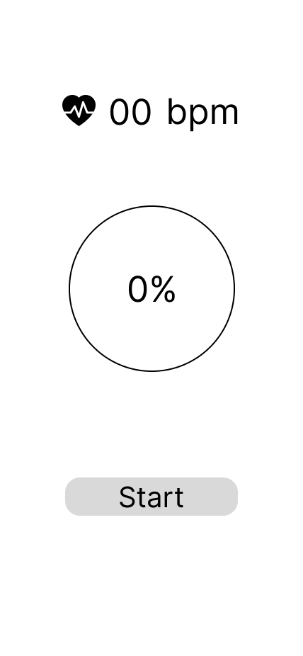
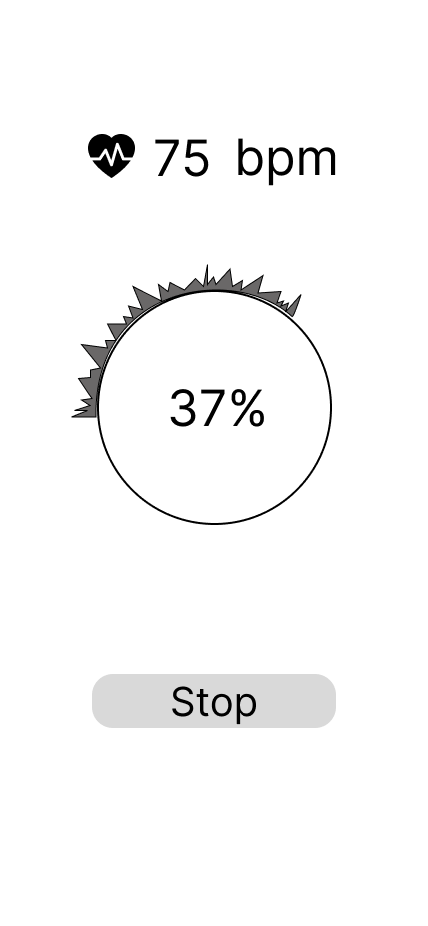
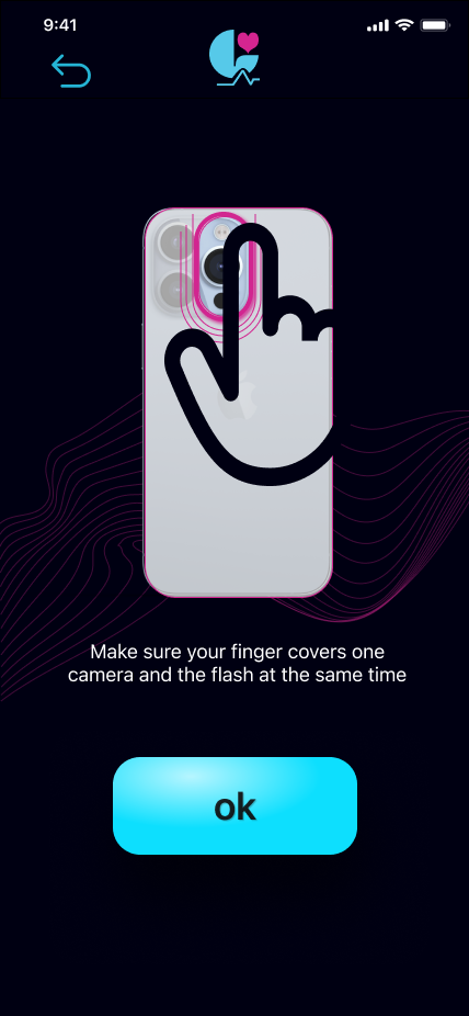
Her mother follows the app prompts and records her heartbeat using her smartwatch. The biometric data is sent to Sara's app in Italy.
Sara sees the bracelet design generated from her mother's heartbeat. It is unlike anything she could have chosen herself.
The bracelet arrives. Sara wears it every day. It carries her mother's heartbeat at her wrist, a physical form of love across distance.
Wireframes
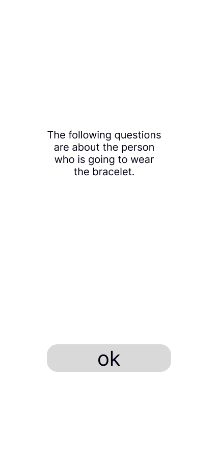
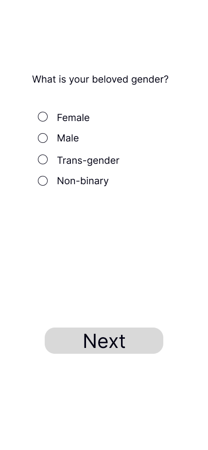
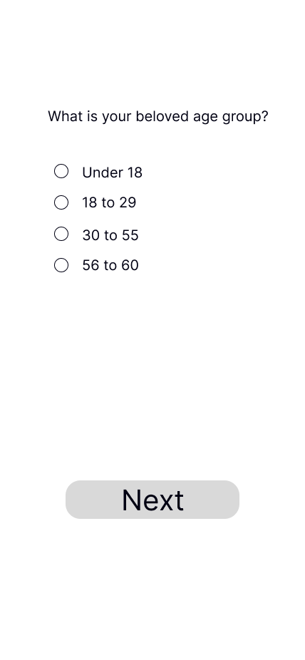
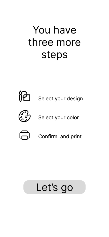
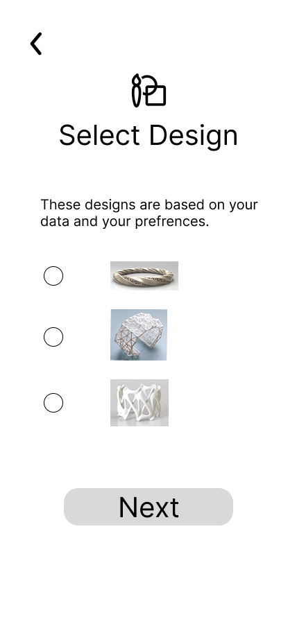
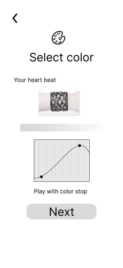
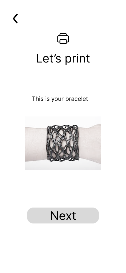
Low-fidelity screens establishing the app's information architecture and interaction flow before moving into high-fidelity design.

User Journey Map
Sara's emotional and functional journey across five stages, from discovering Lapis to wearing the finished bracelet every day.
| 01 · Discover | 02 · Set Up | 03 · Connect | 04 · Design | 05 · Receive | |
|---|---|---|---|---|---|
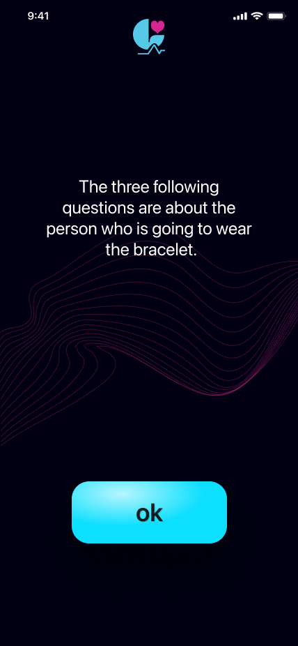
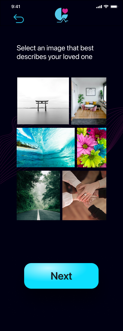
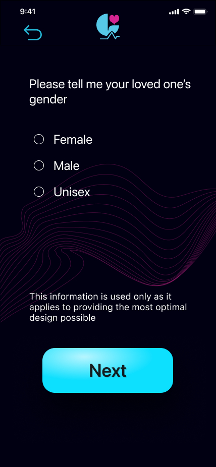
| Actions | Sees Lapis ad on social media. Opens App Store. Downloads the app. | Creates account. Answers 3 questions about herself and who will wear the bracelet. | Invites her mother via the app. Her mother receives a notification and records her heartbeat. | Views the bracelet generated from her mother's HRV. Selects style. Adjusts color. Places order. | Receives the package. Puts the bracelet on her wrist for the first time. |
| Touchpoints | Social media ad · App Store | Lapis app onboarding | Lapis app · Mother's phone · Smartwatch | Lapis app design screens | Email confirmation · Physical bracelet |
| Thoughts | "Can it really turn a heartbeat into jewelry? How does that work?" | "This flow feels thoughtful. I hope mom can do the recording part from Italy." | "Is she doing it right? What if the signal drops? I wish I could be there with her." | "This is actually from her heartbeat. It's completely unlike anything I would have picked." | "It's warm in my hands. It feels like she's right here with me." |
| Feeling | Curious | Engaged | Anxious | Surprised · Emotional | Connected · Moved |
| Emotion | |||||
App Experience Map
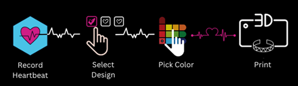
The complete app flow: two distinct heartbeat-capture paths that converge into a shared design and print experience.
Final App Screens
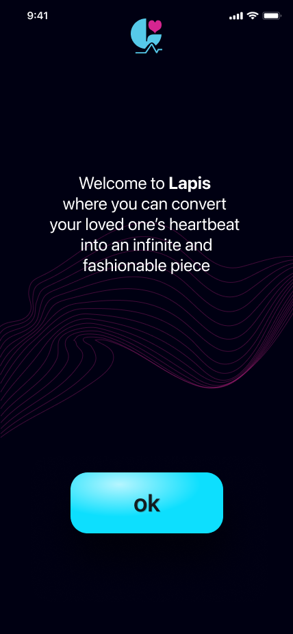
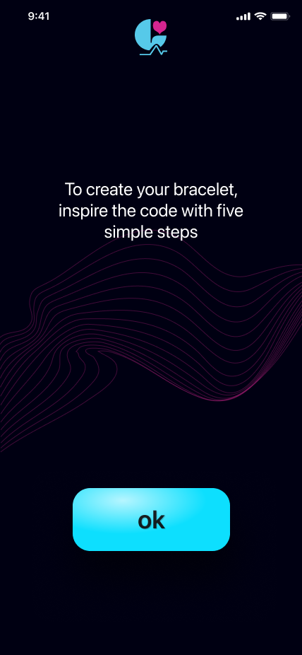
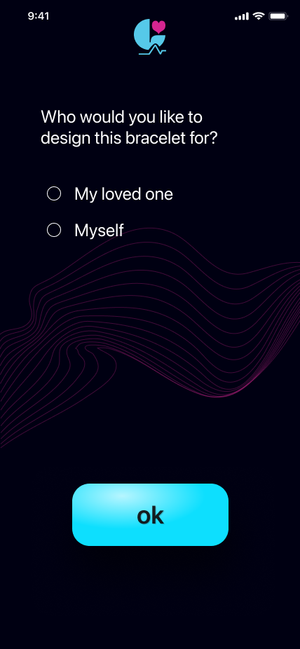
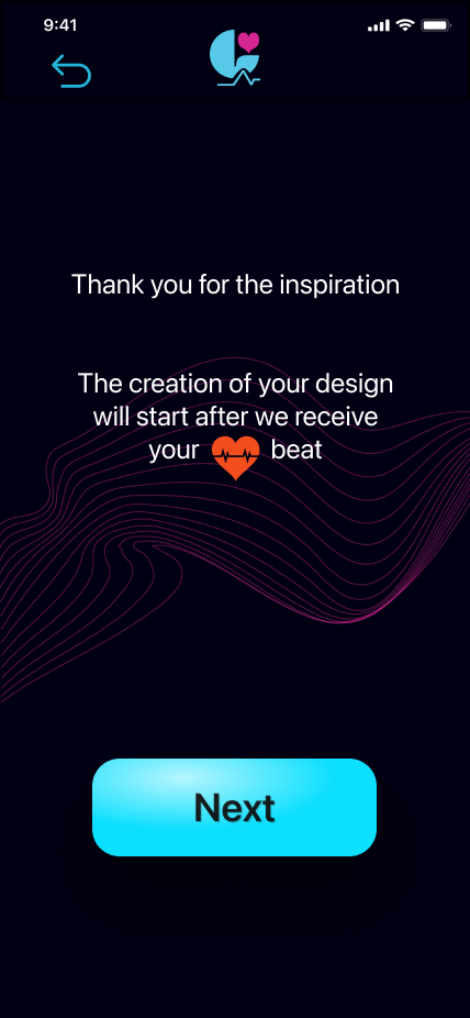
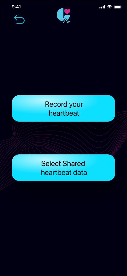
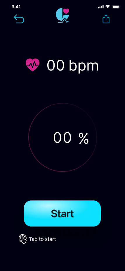
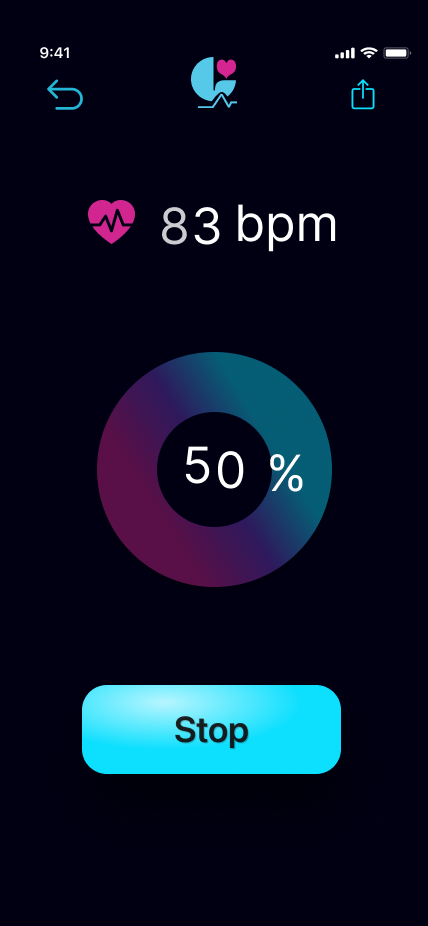
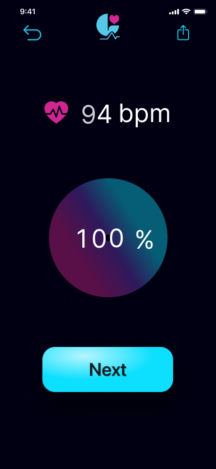
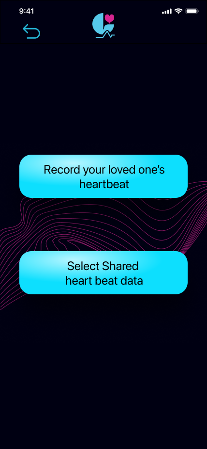
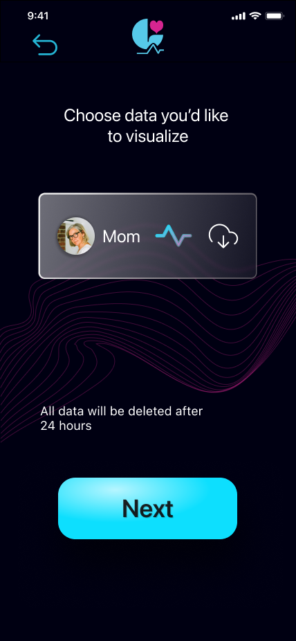
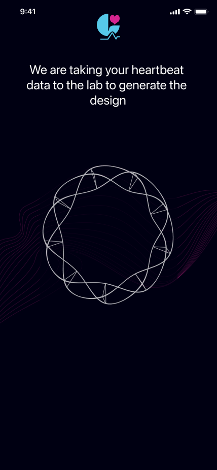
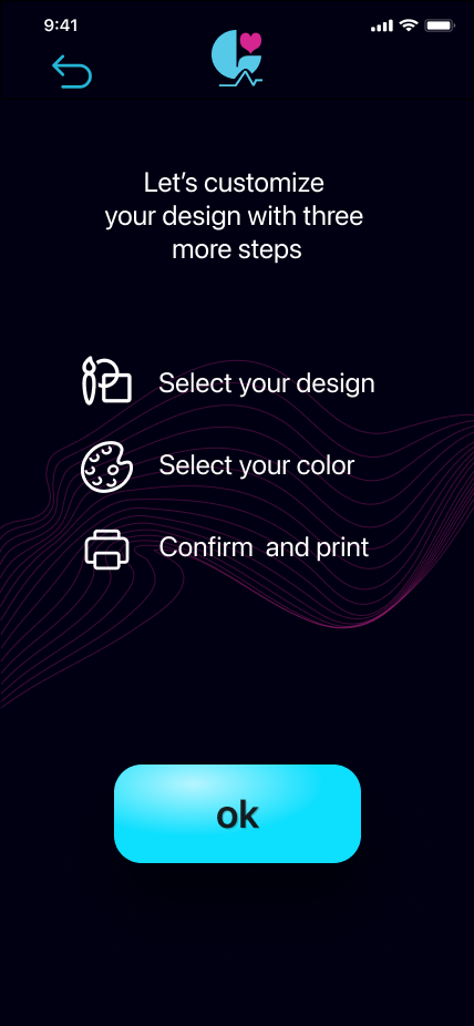
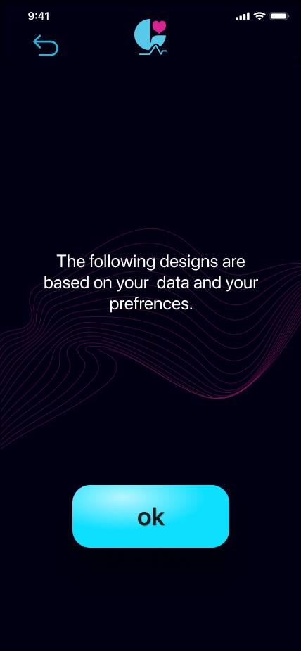
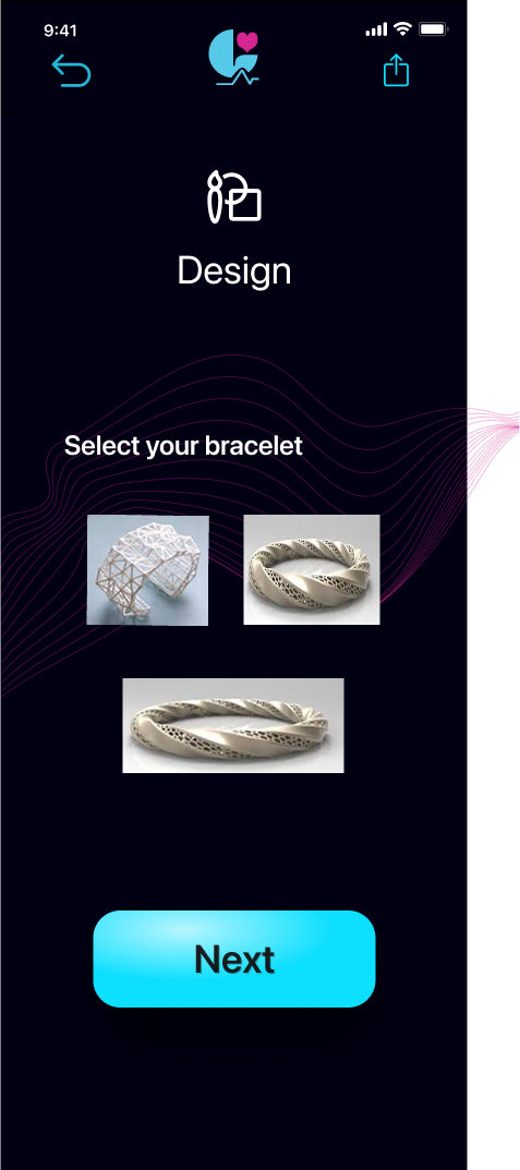
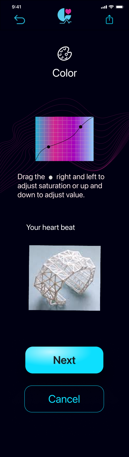
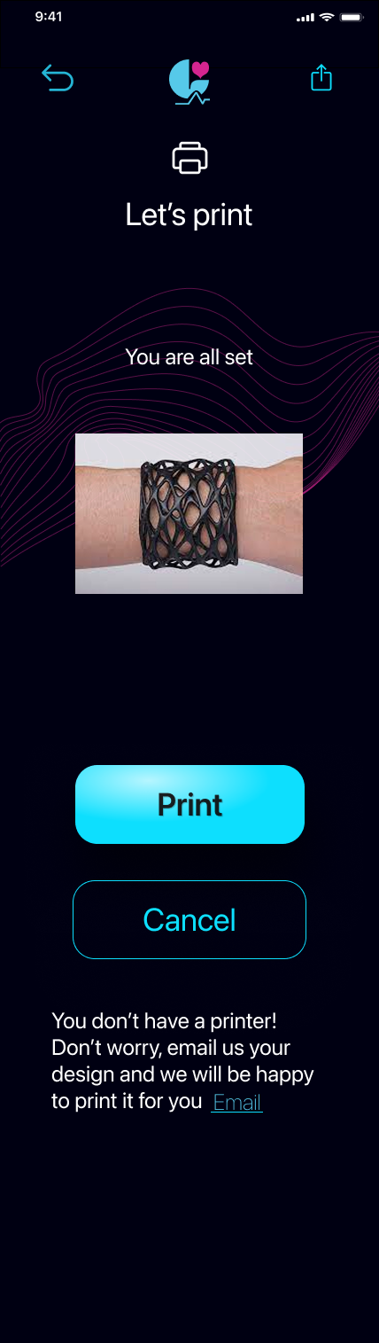
High-fidelity prototype screens covering the full user flow: onboarding, heartbeat capture, both paths, design selection, color customization, and print.
Design Decisions
Every visual and interaction choice in Lapis traces back to a specific rationale rooted in research or user insight.
| Decision | Type | Rationale | Research Connection |
|---|---|---|---|
| Dark background (#000012) | Visual | Biometric data comes from an invisible, mysterious biological source. The near-black background mirrors that unknown depth, making the data visualizations feel like something surfacing from within the body. | User interviews: participants described heartbeat data as "hidden," "private," and "deep inside." Bright UI frameworks would contradict that emotional register. |
| Cyan (#0DDFFE) for primary actions | Visual | Cyan reads as technological, clean, and trustworthy, the exact associations the app needed to establish for the biometric capture step. It also evokes biophotonic light, reinforcing the living-system metaphor. | Inspiration board research: health apps (Oura, Apple Health) use cool blues and cyans to communicate precision and safety. |
| Pink (#D0268F) for heartbeat / HRV data | Visual | Pink is warm, biological, and emotional, distinct from the clinical associations of red. It marks every moment where the user's heartbeat is present: the capture animation, the ECG line, the progress ring gradient. | Survey data confirmed that the bracelet's value is emotional, not medical. Pink signals warmth over clinical precision. |
| Pill-shaped (100px radius) buttons | Interaction | Rounded forms feel gentle and non-threatening, which matters a lot in an app where users interact during emotionally vulnerable moments. Sharp UI corners would introduce friction at the wrong time. | Emotional design principle: form language communicates emotional register before content is read. |
| Wave background animation | Visual | The undulating pink wave pattern appears on key screens (welcome, thank you, waiting). It evokes a heartbeat oscillation without displaying raw data, maintaining the emotional tone while the technical process runs in the background. | Naturalistic data: participants described the heartbeat as "waves," "rhythm," and "pulse" rather than graph lines or numbers. |
| Two-path flow (own vs. loved one's HRV) | Architecture | Research showed two distinct use cases: users who want to wear their own heartbeat, and users who want to carry someone else's. Both paths converge at design selection, keeping the experience unified while honoring the distinct emotional journeys. | Interview findings revealed both use cases were equally valid and emotionally distinct. Collapsing them into one flow would have diluted the personal meaning of each. |
| Email fallback on print screen | Interaction | "You don't have a printer? Don't worry, email us your design and we will be happy to print it for you." This removes a potential drop-off point by offering a human alternative to self-printing. | Accessibility principle: the hardest moment to lose a user is right before conversion. The fallback preserves the emotional investment even when the technical path is blocked. |
Physical Output
The end of the Lapis experience is tangible: a 3D-printed bracelet, derived from a loved one's heartbeat, worn at the wrist every day.
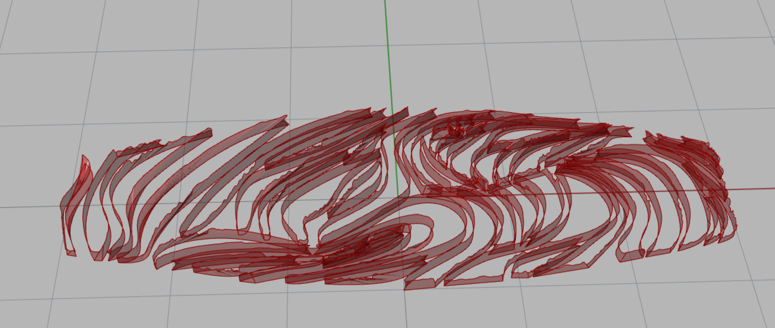
Early fabrication: testing how the ECG-derived lattice structure behaves when printed in different materials and at different scales.
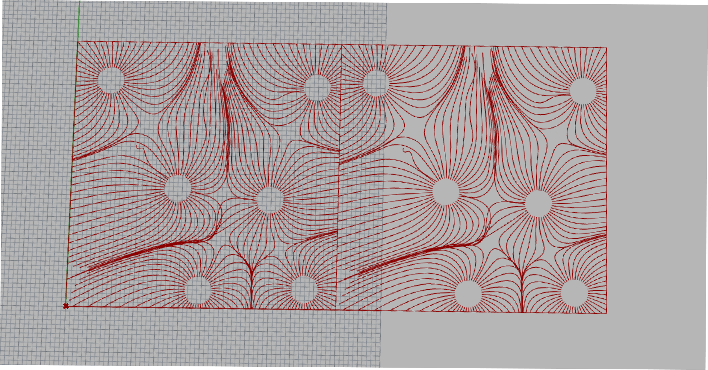
Close-up of the parametric lattice surface. The texture is unique to each person's cardiac data, functioning like a biological fingerprint.
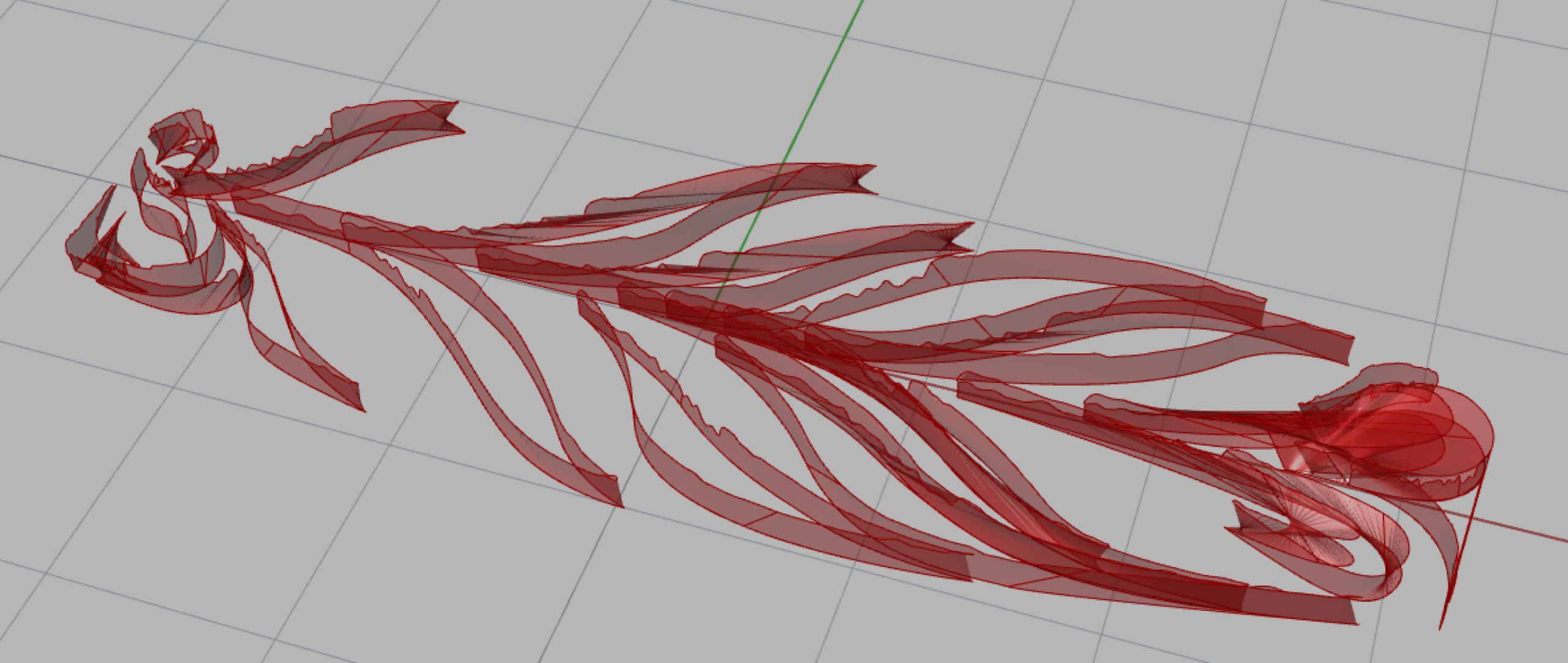
Material exploration: comparing rigidity, tactile feel, and wearability across different 3D printing substrates.
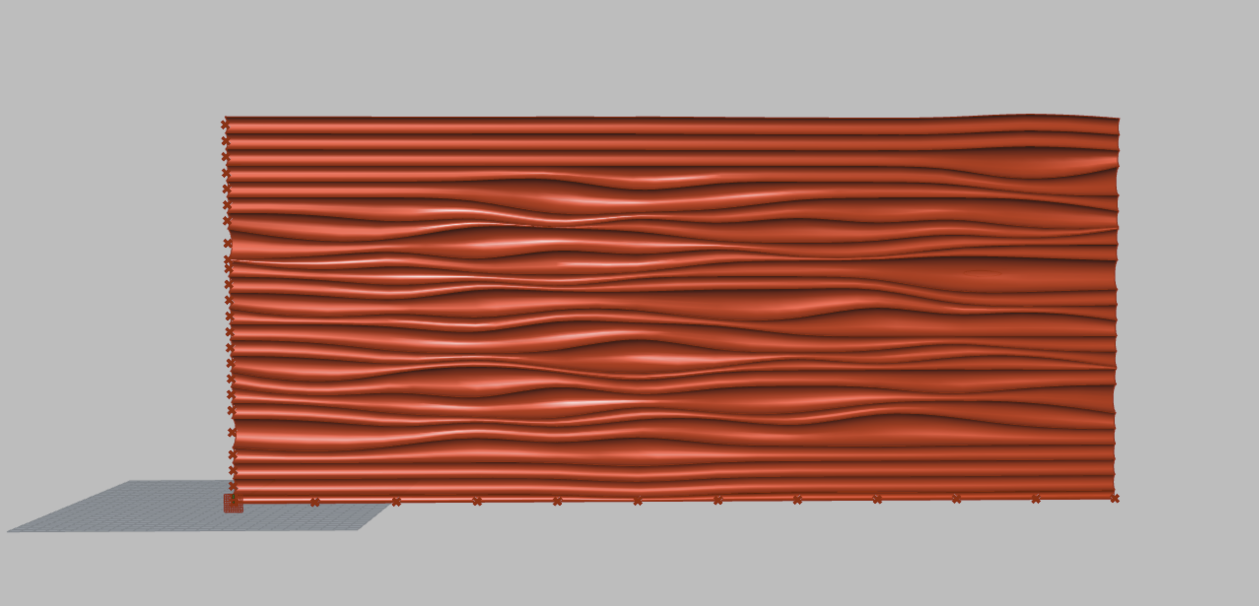
The finished bracelet worn on the wrist, the position that maximizes daily skin contact and reinforces the heartbeat symbolism at the pulse point.
Designing Lapis required navigating a tension most UX projects don't face: the product's emotional value proposition is deeply personal, but the technical pipeline underneath it (PPG capture, parametric modeling, 3D printing) is inherently complex. The most important design decision was to keep those two things completely decoupled. Users should feel they are sending love, not configuring a biometric workflow.
Future iterations would explore notification design for the async loved-one recording flow, haptic feedback during HR capture to reinforce the biometric moment, and a post-delivery ritual within the app to mark the first time the bracelet is worn.